Want to know more? Let’s have a chat!
taliaren0826@gmail.com
© 2026 Talia R
Timeline:
8 Weeks
Apr-Jul 2023
Team:
2 UX designers
1 Product manager
1 Marketer
Role:
UX Design
UX Research
Product & Visual Design
Tools:
Figma
Photoshop
Illustrator
Pen & Paper

Optimize the first-ride experience across both digital and physical touch points
OUTCOME
Redesigned the customized service feature on the app to enhance usability and improve adoption
Created a physical welcome card from scratch, reinforcing brand identity and elevating first-order experience
Designed the hero image, banner, and pop-up window for the first-order marketing campaign
CONTEXT
DiDi is China’s largest mobility platform, serving over 550 million users. DiDi Luxe is its premium service, offering luxury cars and professional drivers to deliver a five-star travel experience
In 2023, I interned at DiDi Luxe department as a UX Designer, collaborating with the team to launch the first-order service, aimed at enhancing first-time passenger experience
IMPACT
33%
Adoption
18%
NPS (Net Promoter Score)
Slow New User Growth
Many potential users were not aware of or familiar with DiDi Luxe, which limited its visibility and slowed new user growth
Underutilized Premium Feature
The customized service was frequently overlooked, as many new users skipped or abandoned it. This weakened the intended premium impression of DiDi Luxe’s five-star experience, which is central to its brand positioning
PROBLEM
UNDERSTANDING USERS
First-Time Passenger Mindsets
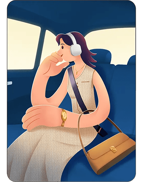
Choosing Luxe when other rides are hard to get
Situation driven
Creating memorable or special moments
Experience driven
Willing to try something new and different
Curiosity driven
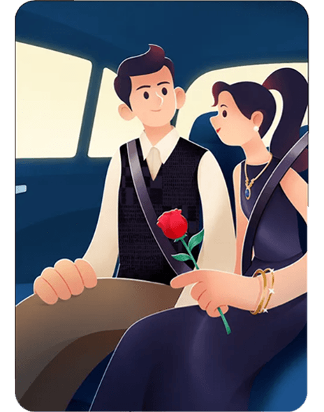
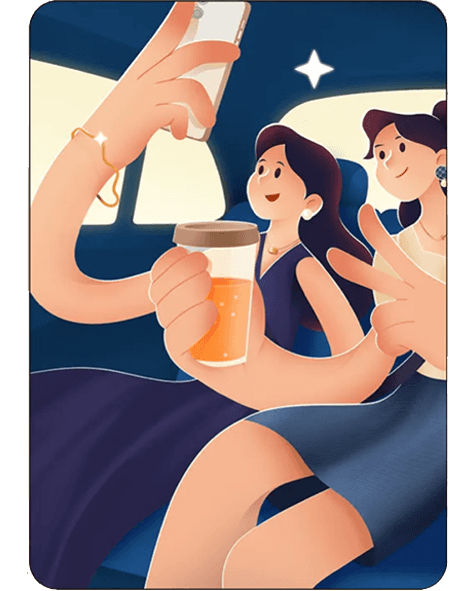
First-time passengers expect DiDi Luxe to stand out from regular rides. They are willing to pay more if the experience feels unique, personalized, and memorable
Surprise
Personalized service
Life quality
Seamless interaction
Luxurious feeling
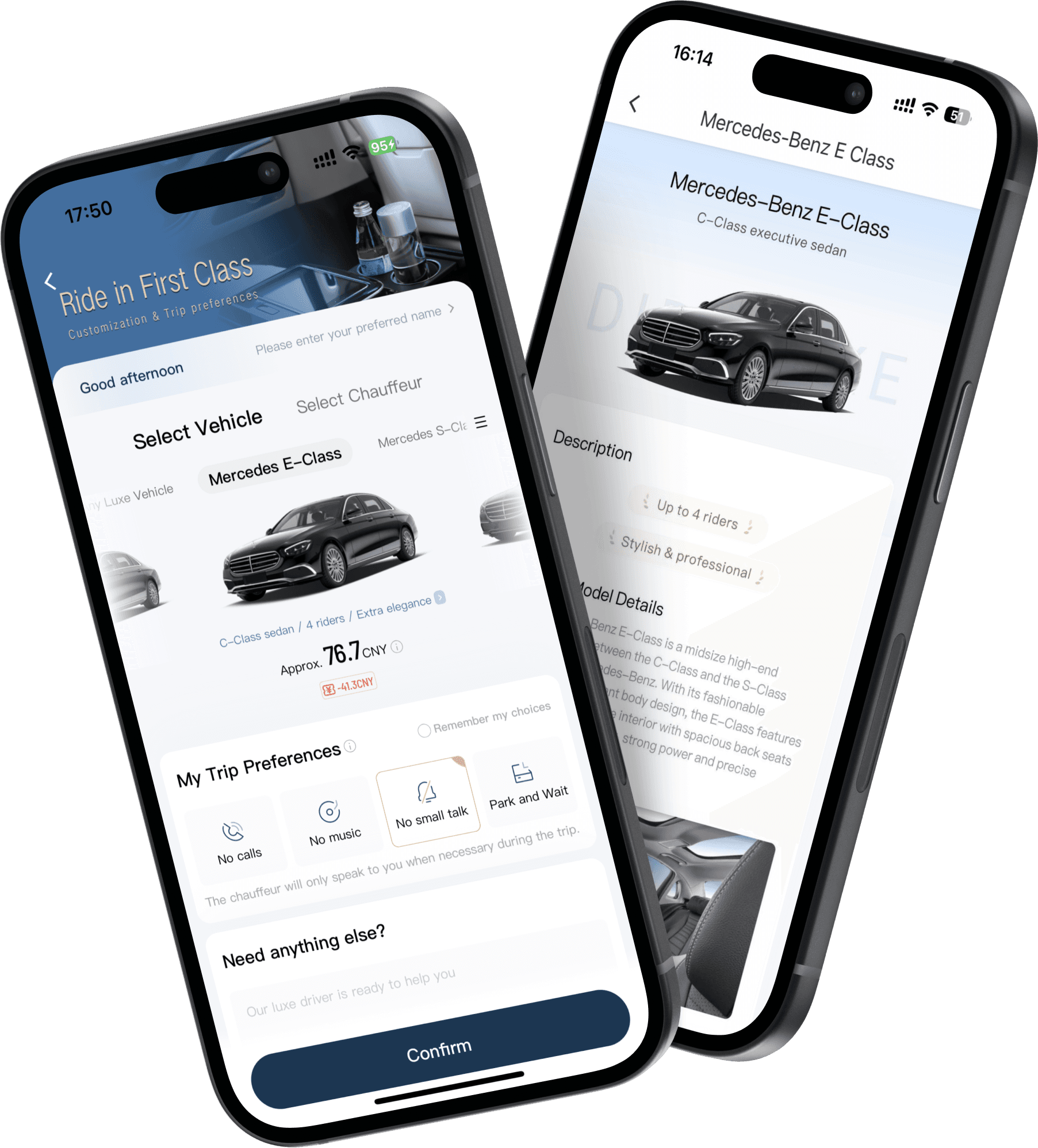
SOLUTION 1
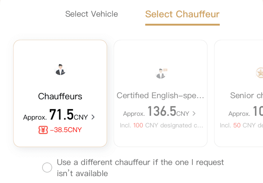
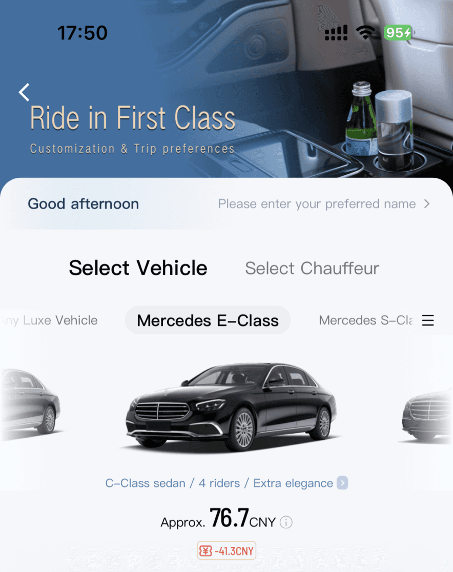
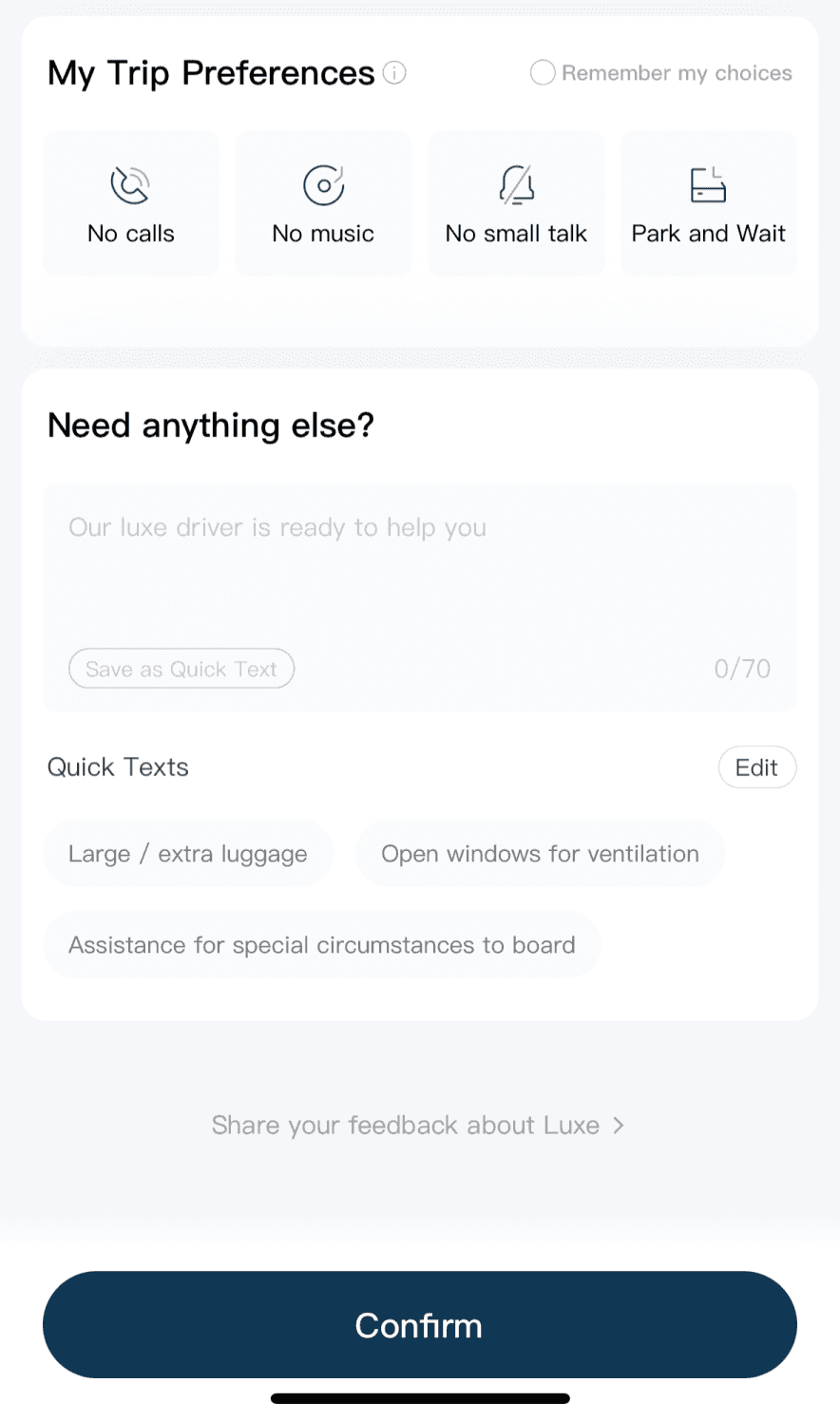
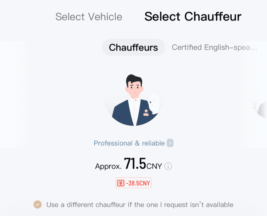
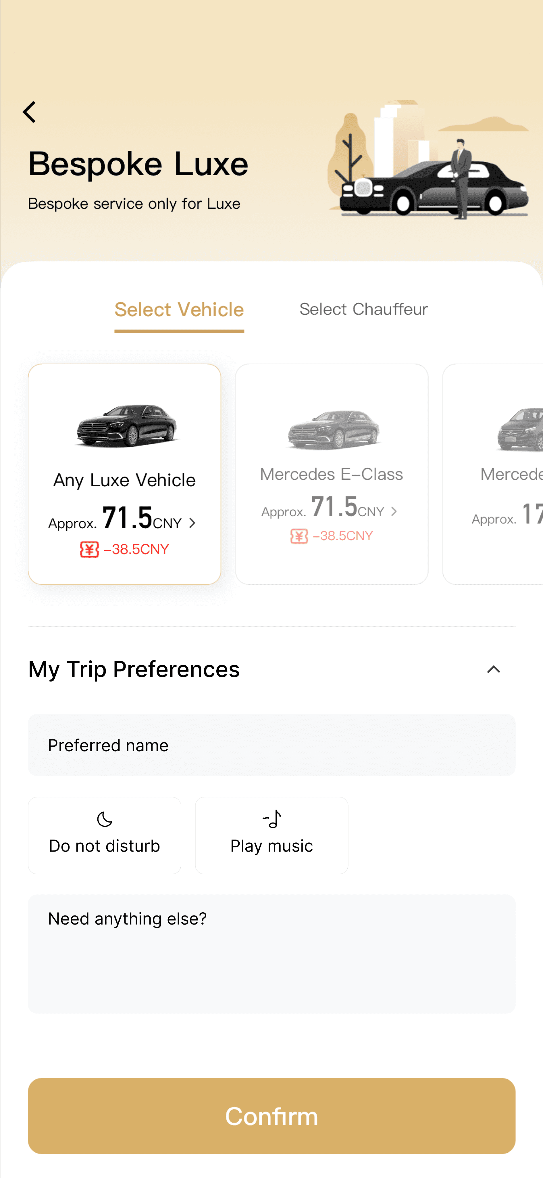
Redesign Customized Riding Service Feature
BEFORE
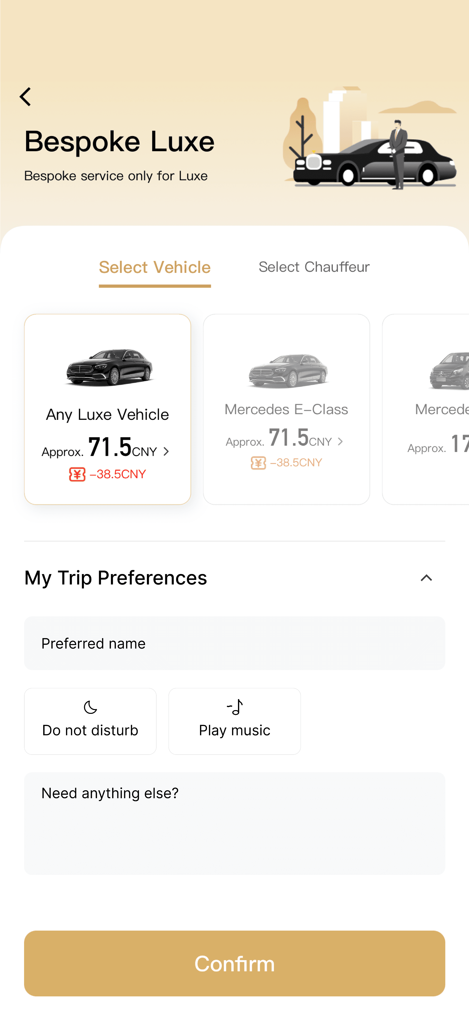
AFTER

GOALS
What We Want To Achieve
⭐️ Clarify hierarchy and improve usability
Organize structure and visual priority so that users can quickly understand options and make confident choices
🎩 Strengthen brand perception
Highlight DiDi Luxe’s premium positioning through refined visuals and copy to differentiate it from standard services
🎉 Reduce cognitive load
Simplify interactions and minimize unnecessary steps to create a seamless flow
DESIGN AUDIT
Finding Key Experience Gaps
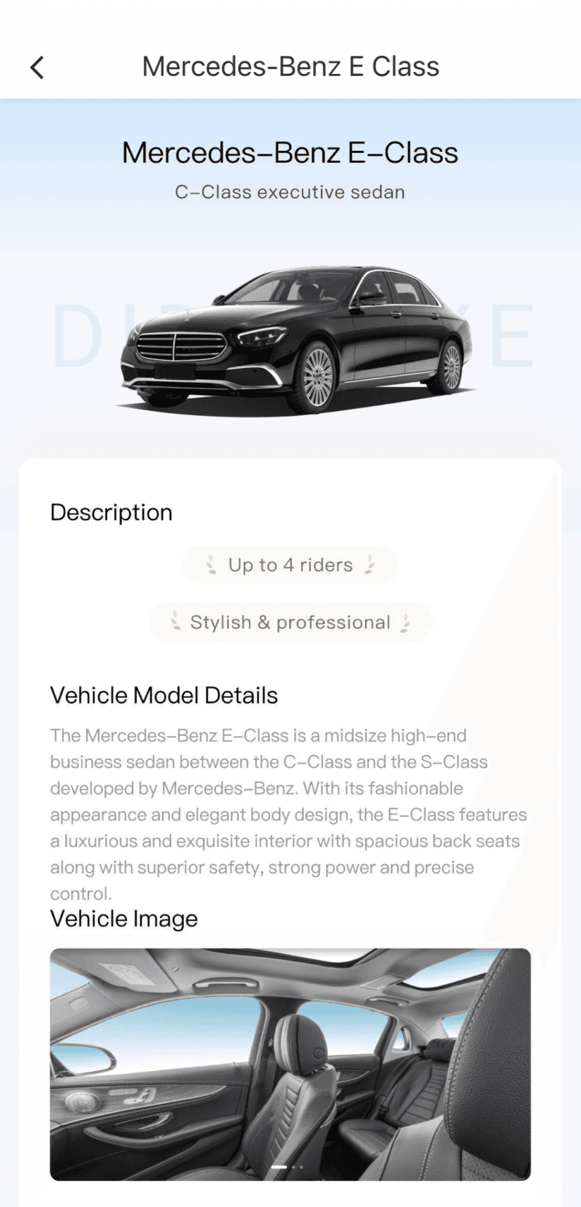
I started with a design audit of the existing customized service page, identifying issues in visual clarity, usability, information structure, and the lack of a strong premium brand impression
The illustration failed to convey brand’s identity
Overly bright color
Hard to distinguish different types of cars
The visual focus was on price rather than the car
Hard to quickly locate the car users want
Confusing wording
Poor information hierarchy
Easy to ignore
DESIGN STRATEGY
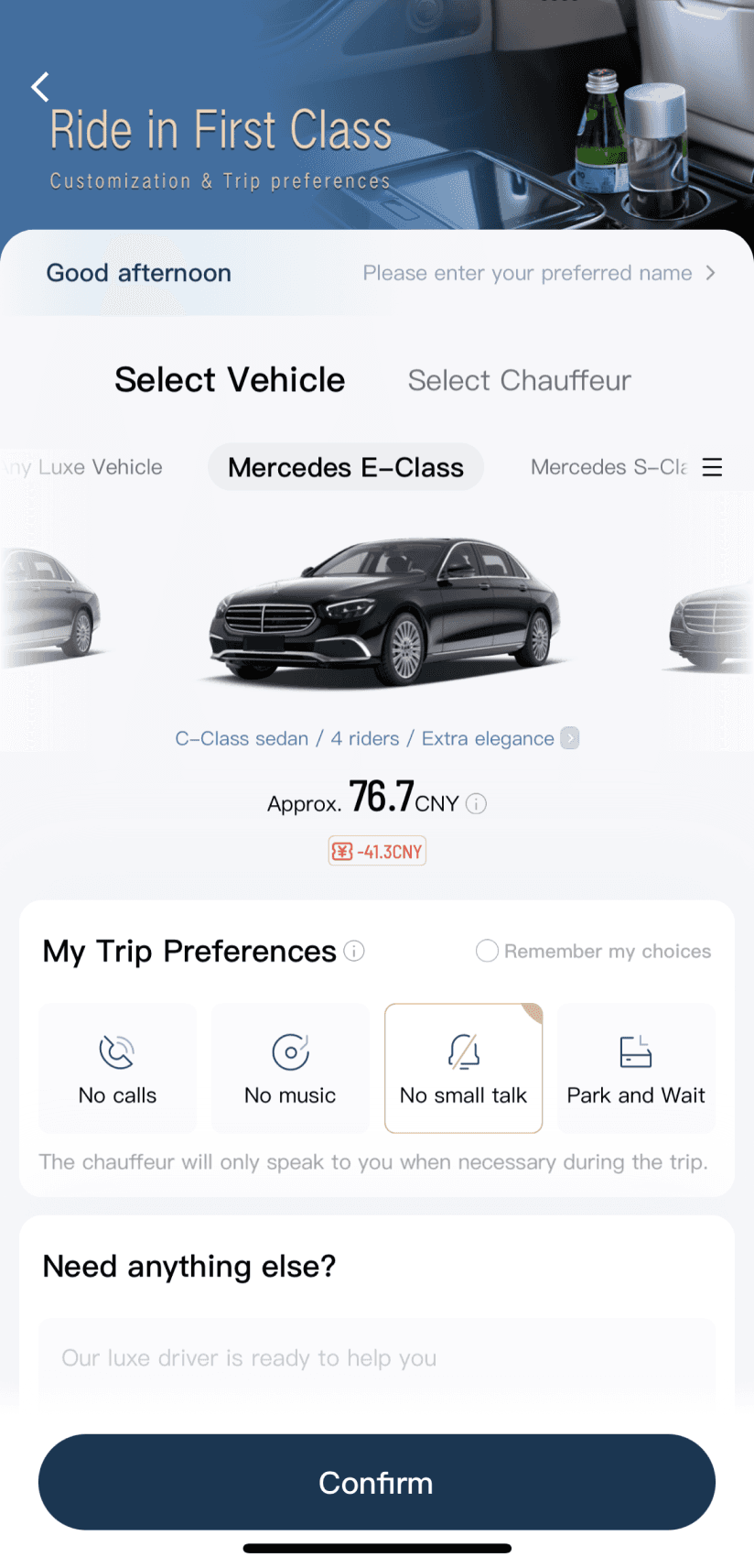
User Flow Optimization
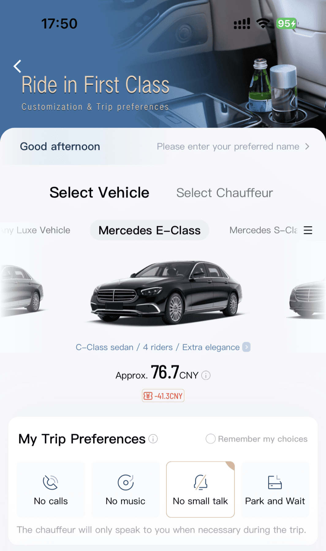

Key personalization placed at the start for visibility
Made the car the main focus for better hierarchy
Reduced choice overload by showing one choice at a time
Added key descriptors to highlight the car’s features
Price shown as secondary to avoid distraction
Explanation text reduced ambiguity and built user confidence
Reduced repeated setup
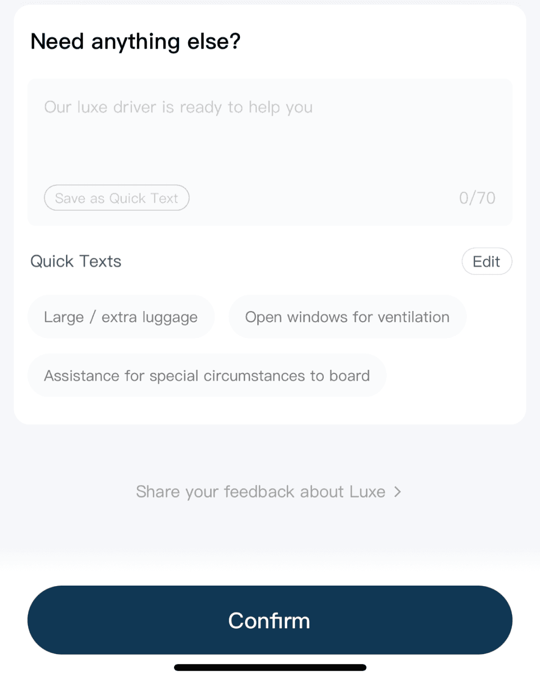
Quick Texts simplified communication by reducing typing effort and enabling faster customization
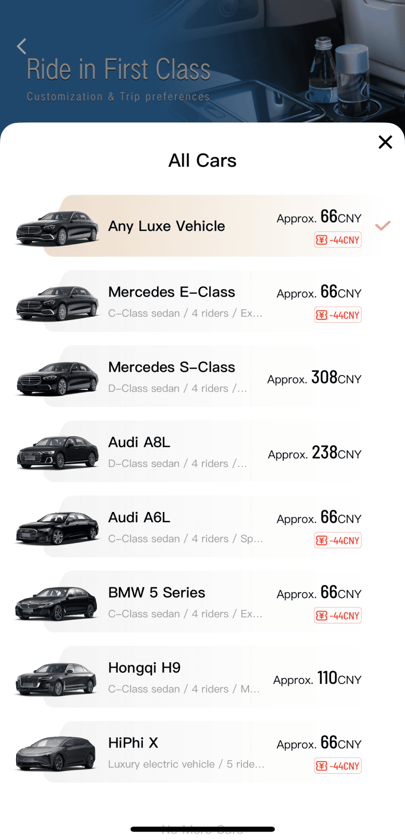
Allows users to view and compare all cars at once, reducing time spent scrolling and facilitating faster decisions
Helps users better understand each cars, reduces uncertainty, and improves visibility with a clear entry point
Brand Expression
#D9B068
Color: Light gold tone, warm but lacking modernity, with limited premium feel.
Visual: Flat illustration style that did not highlight the uniqueness of the luxury ride
#143755
Color: Deep blue tone, calm and elegant, more aligned with a high-end travel identity
Visual: Realistic interior background directly communicates the luxury experience
SOLUTION 2
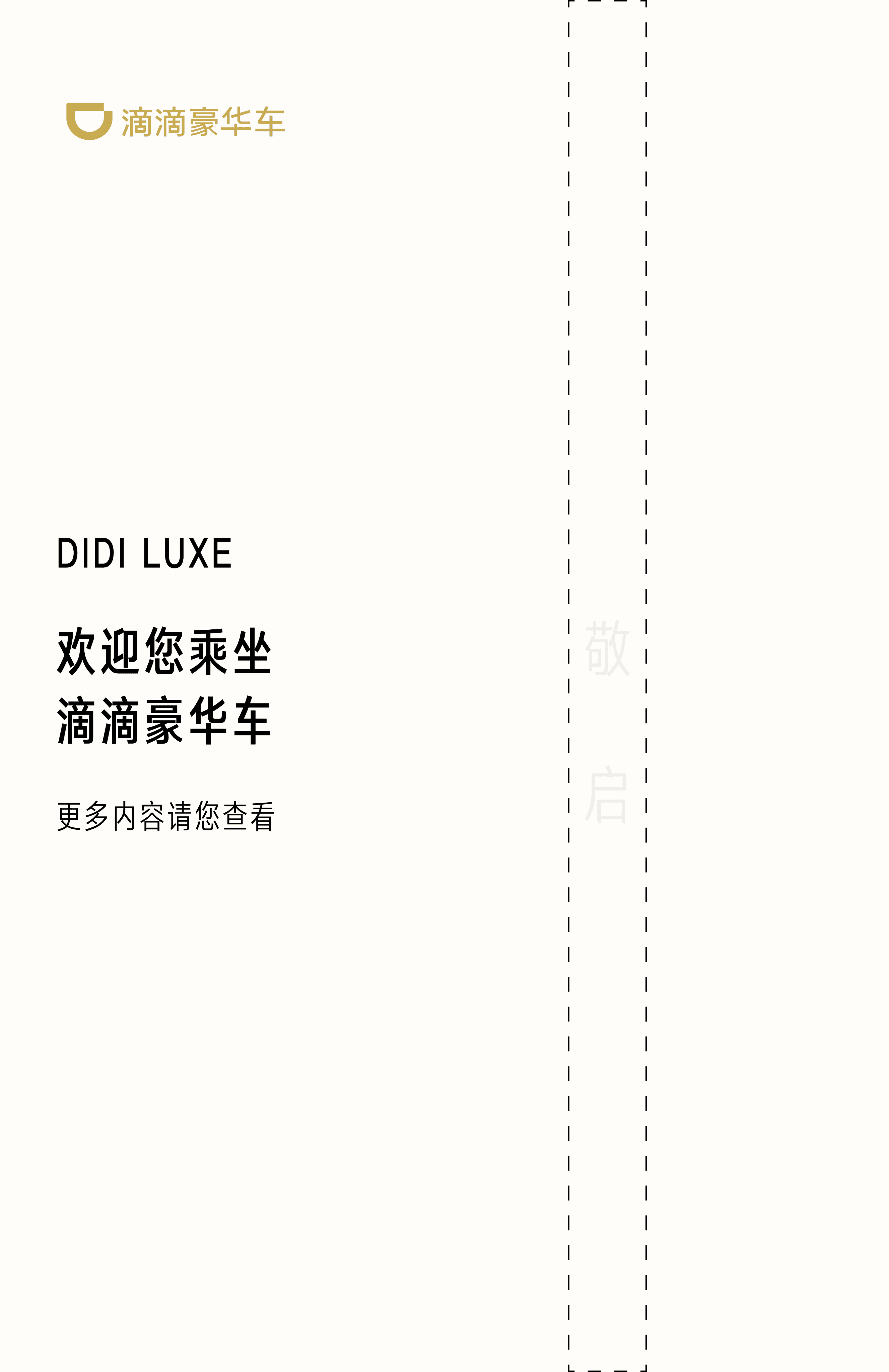
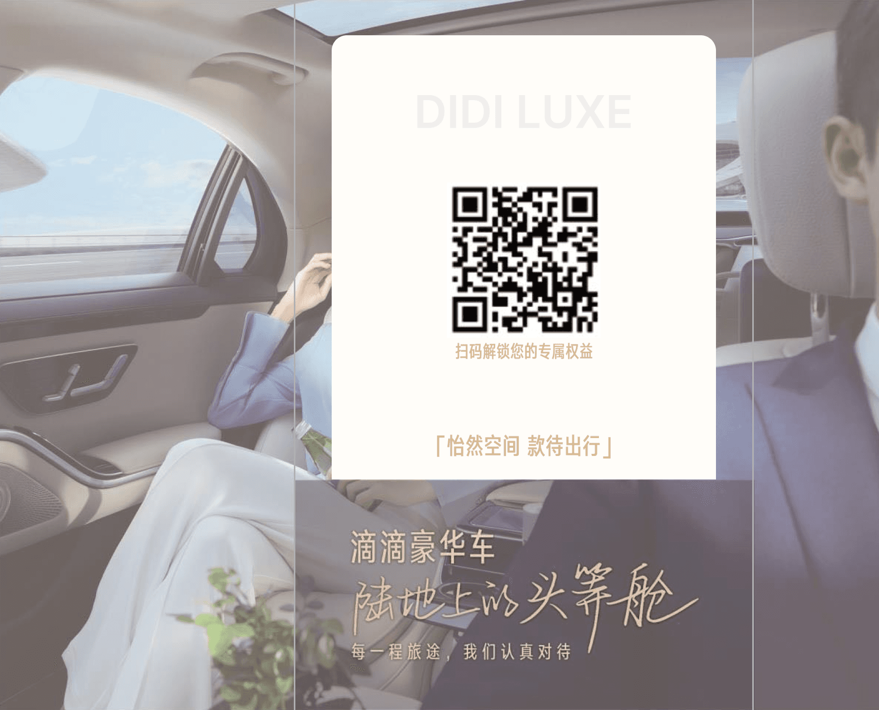
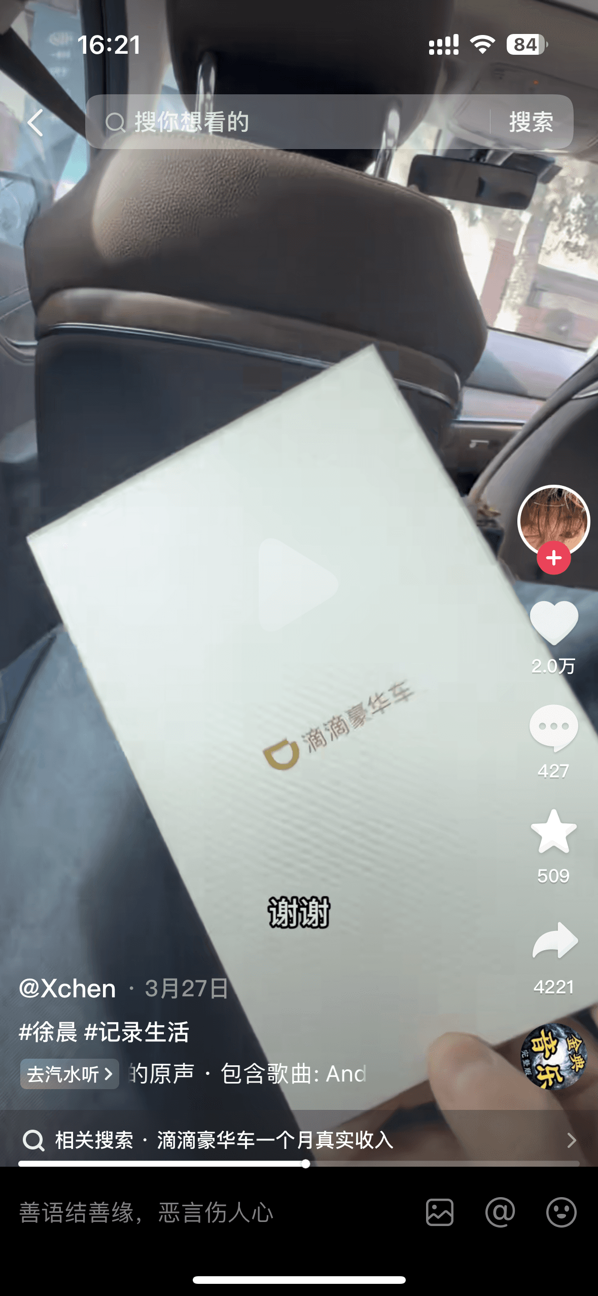
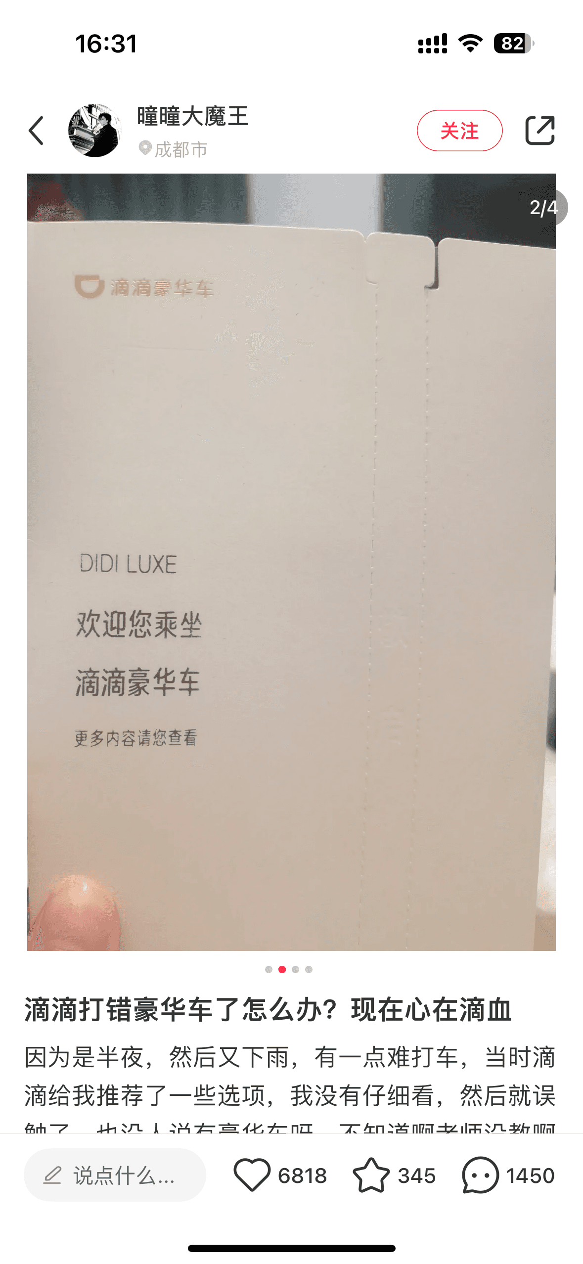
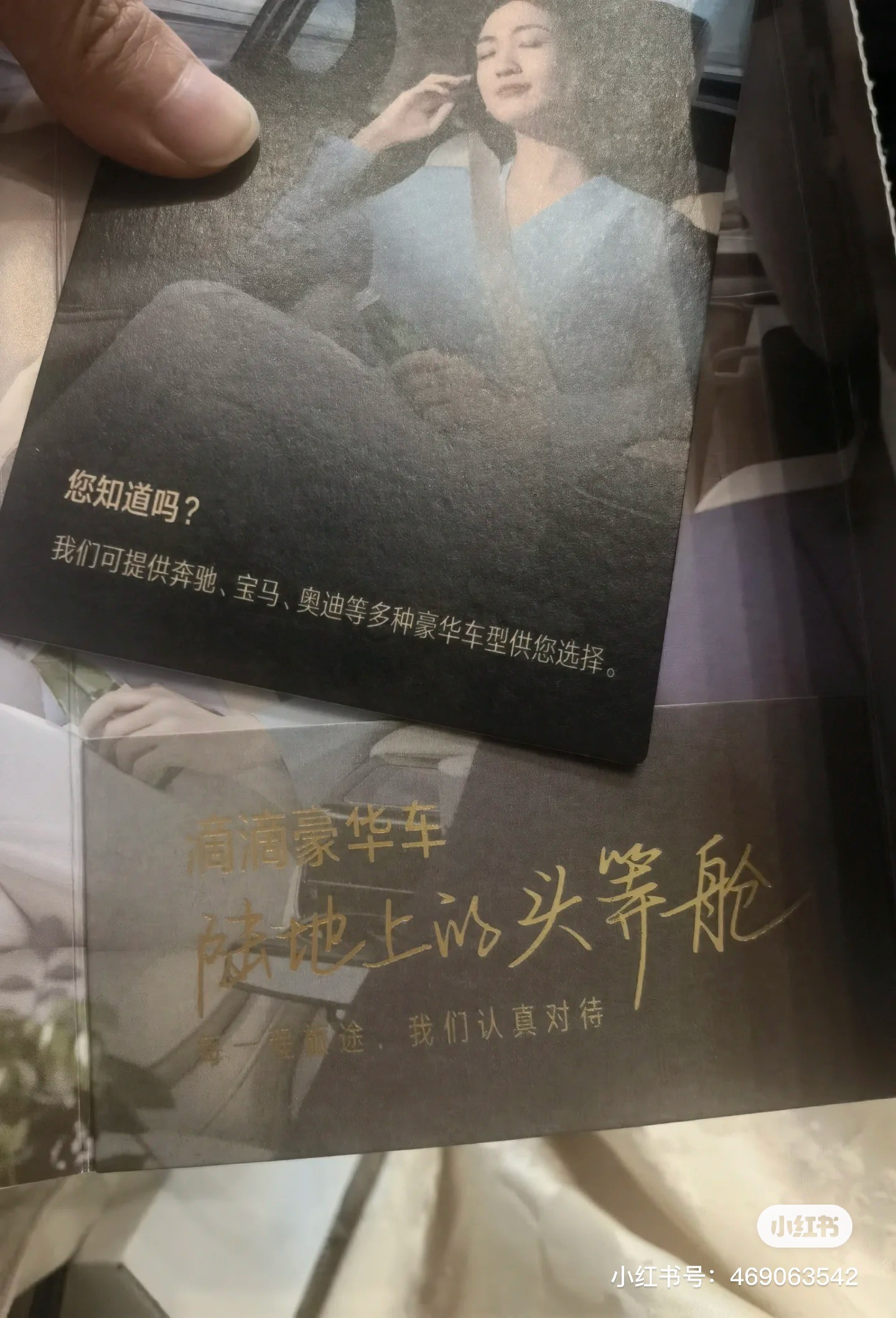
Create Physical First-Order Welcome Card
According to the REWARD EFFECT, when people receive benefit such as discounts or points after using a product or service, they tend to develop a more positive attitude toward it. This motivates them to use or recommend the product again. To address the problem of low awareness and slowing new user growth, we planned a reward that delivers a personalized and memorable experience, encouraging users to re-engage with DiDi Luxe
After multiple internal discussions and meetings, we then negotiated with suppliers regarding the production budgets for different card designs. Ultimately, we selected one as the final design
The chosen design balances simplicity and interactivity, featuring a concise layout with subtle details and a personalized message. With carefully selected materials and colors, it aims to create an engaging and memorable experience for first-time users
Card shell-Front
Tear-off design
Hot stamping
Card shell-Back
Hot stamping
Internal design after tearing
Card-Back
Card-Front
Coupon
QR code
Intaglio
printing
What Kind Of Reward?
CONCEPT & DESIGN
A welcome card with a coupon for the next ride and an introduction to DiDi Luxe

Physical Product
Next Ride Coupon
Concise & Interesting
Easily Stored
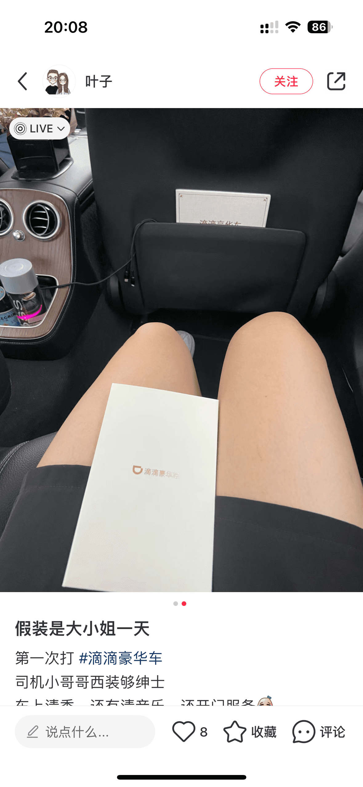
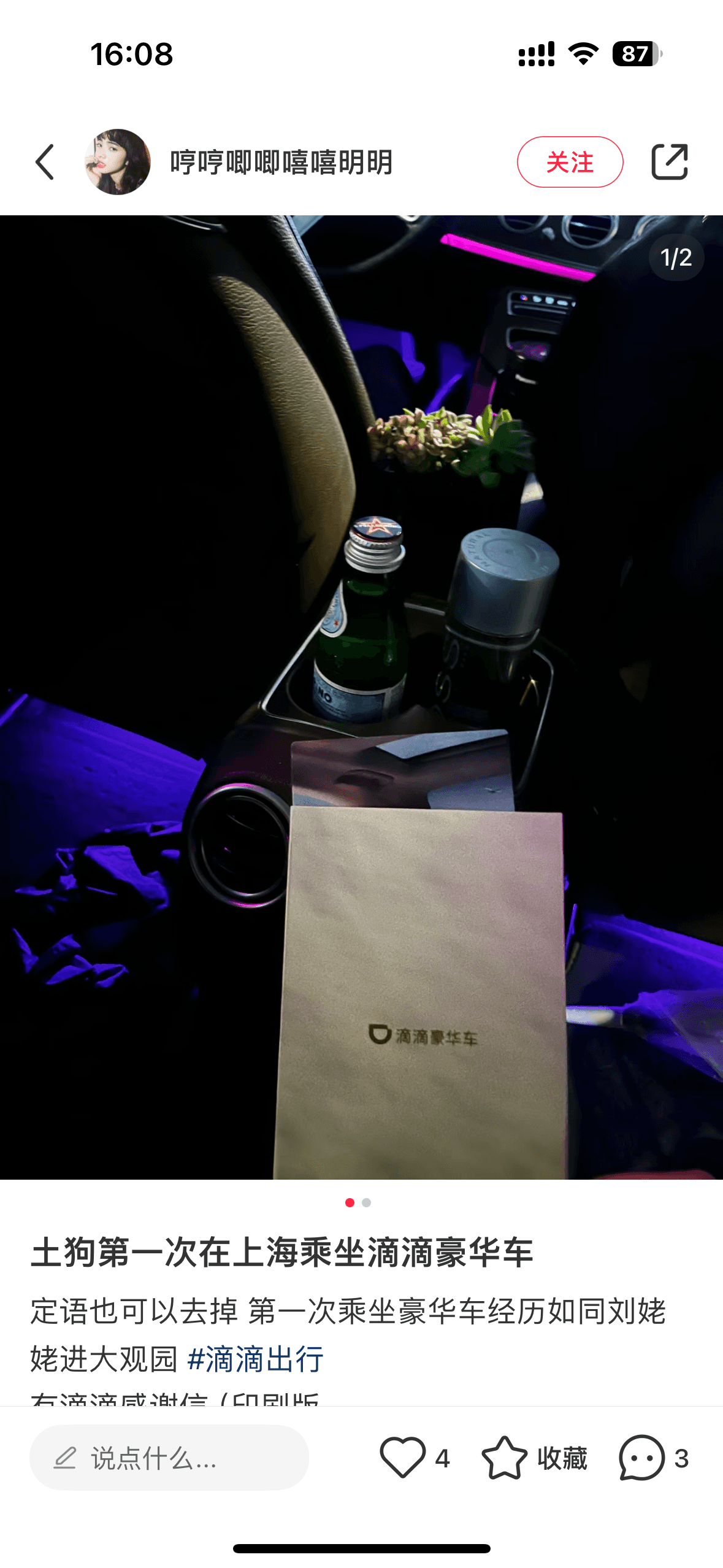
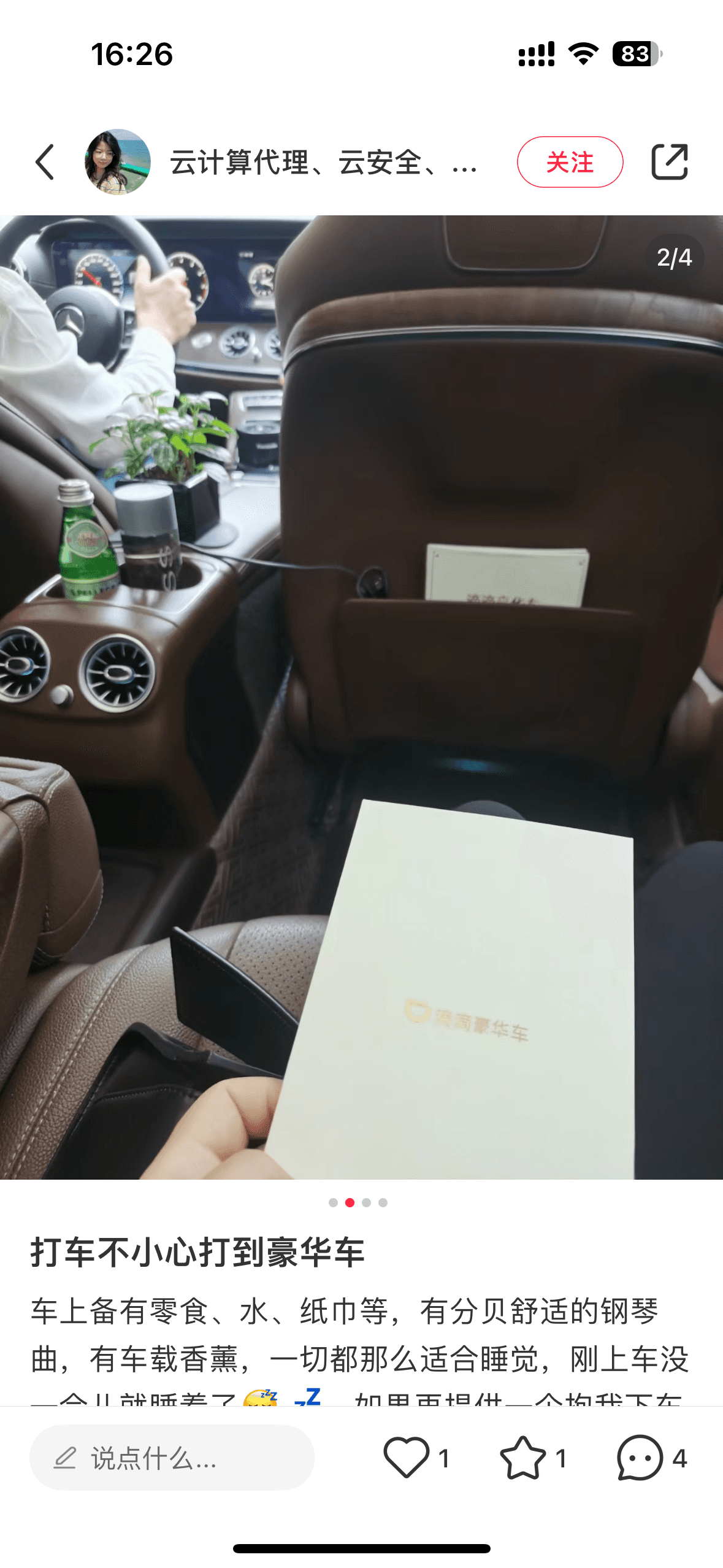
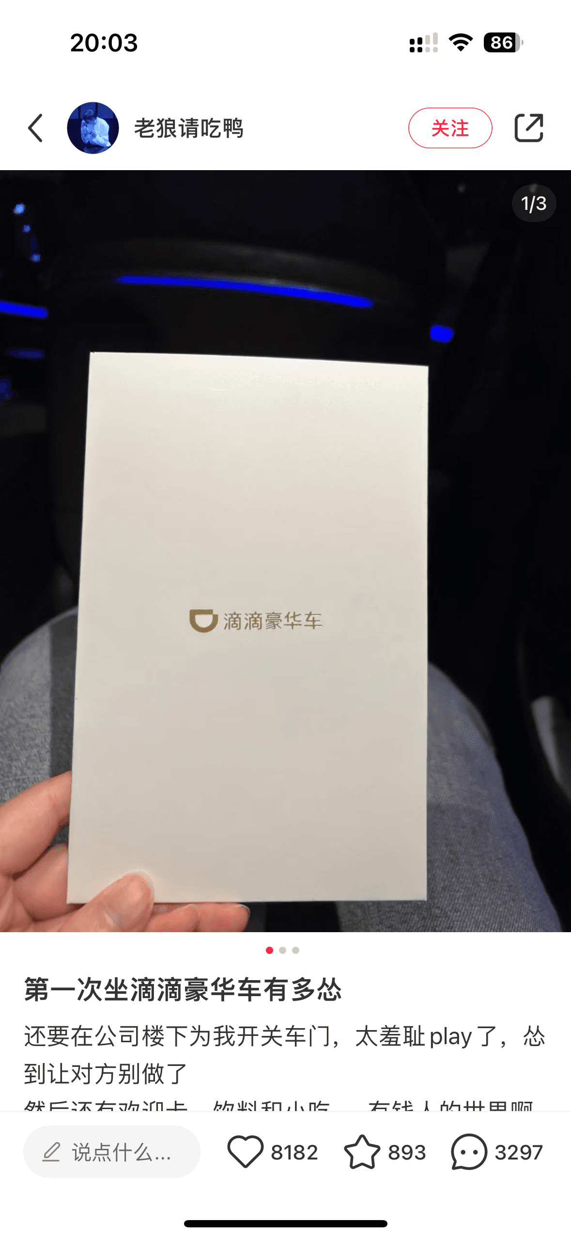
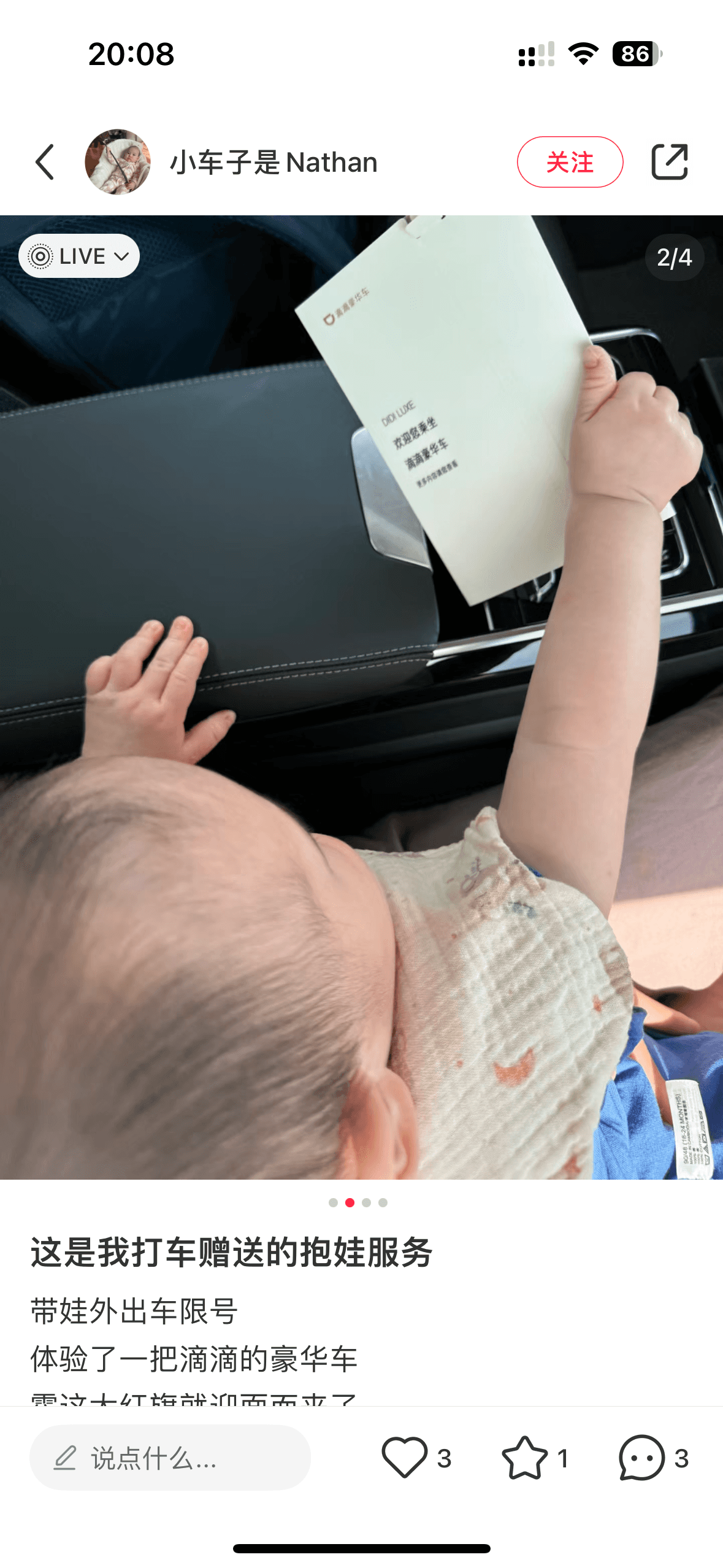
FEEDBACK
User Reactions On Social Media
Users shared their appreciation for the card's thoughtful design and the personal touch it brought to their first-ride experience. Many users mentioned how this made them feel valued, special, and surprised
“Princess for a day”
“It blew my mind!”
“Very cozy”
“So thoughtful”
“Feels really good”
“Such a great experience”
“I love these details”
SOLUTION 3
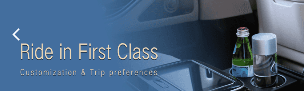
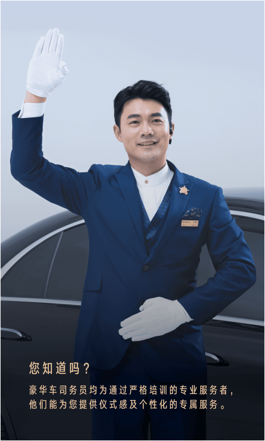
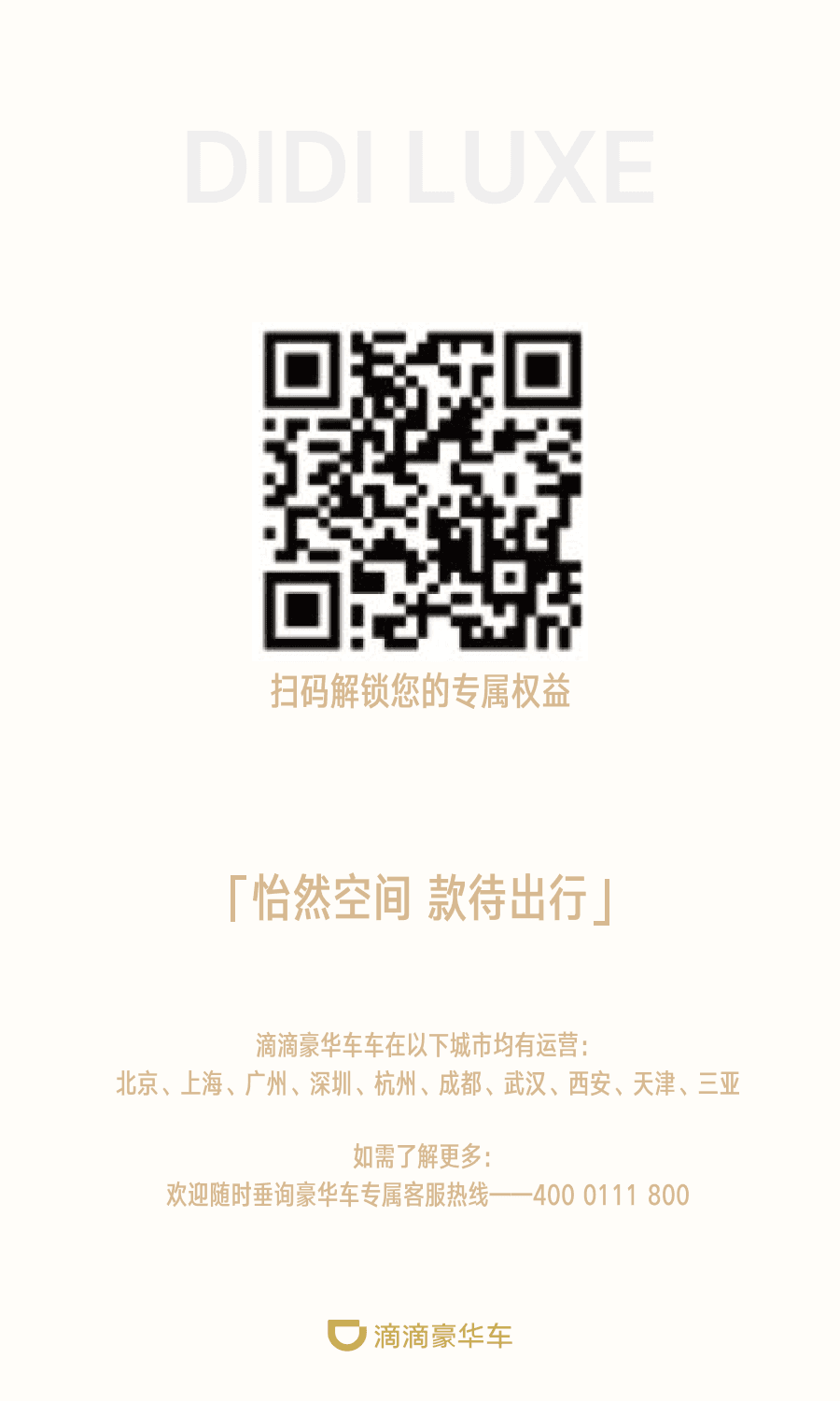
Design Visual Assets For Marketing Campaign
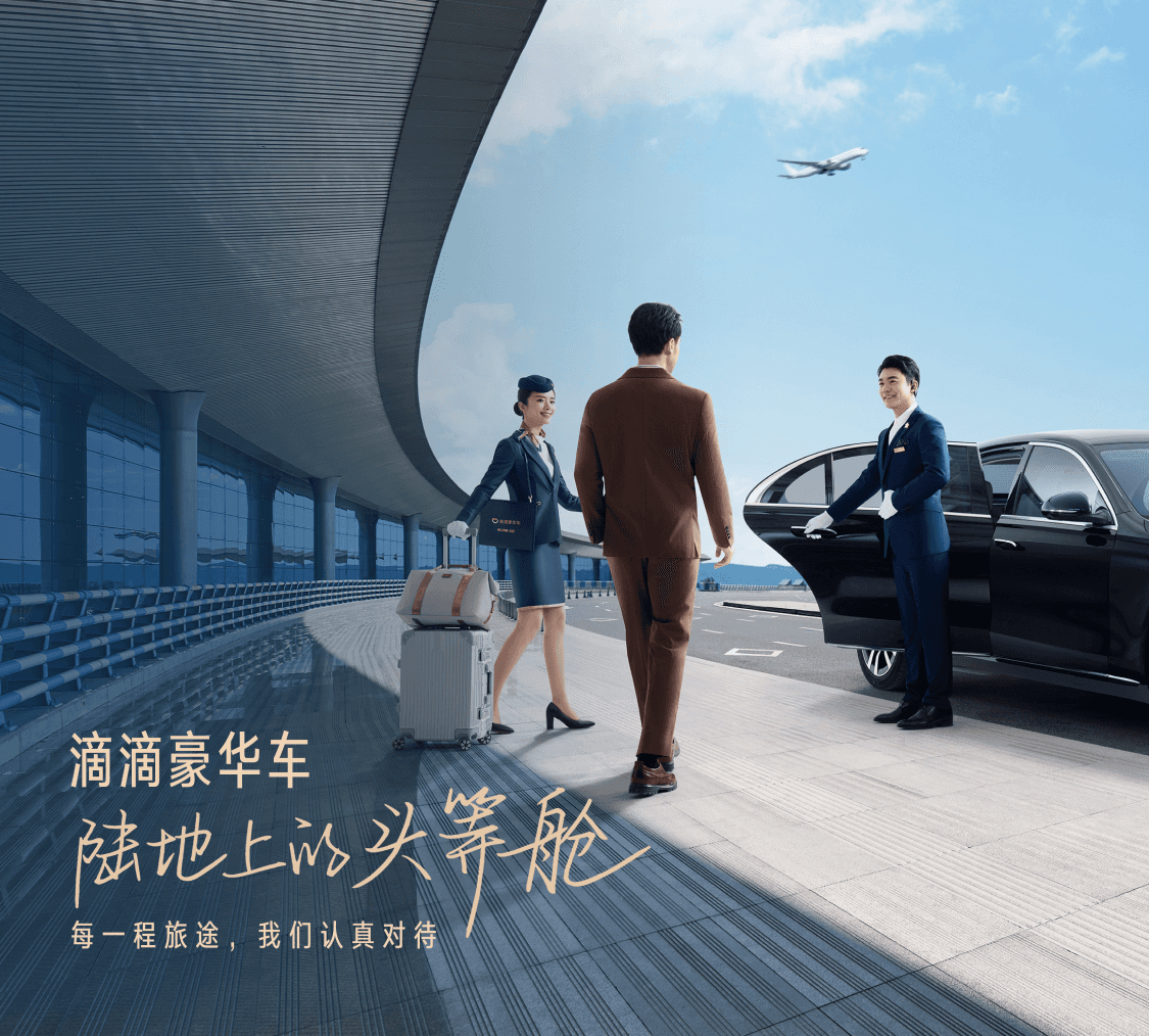
Hero image
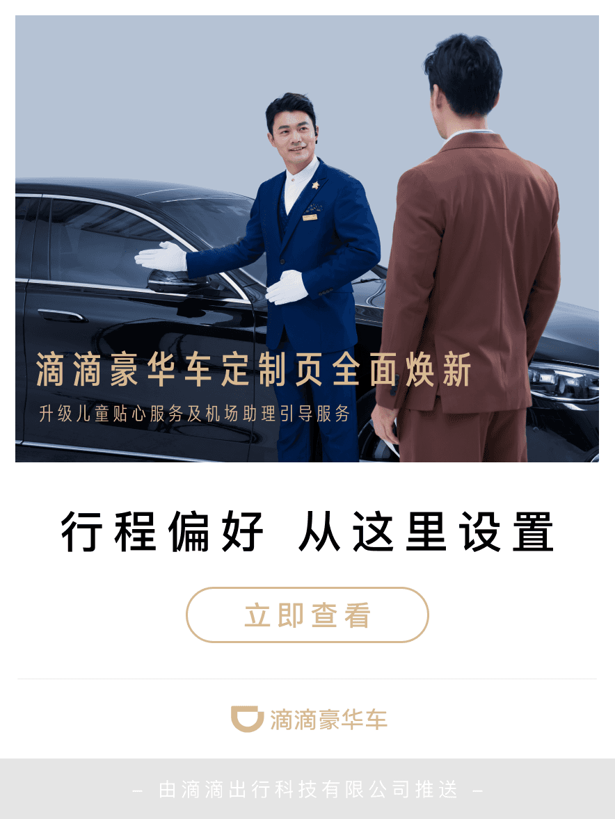
Pop-up window
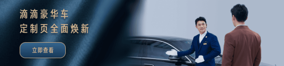
Banner
To enhance awareness and attract more first-time users, I collaborated with the marketing and operations teams on visual assets for the first-order campaign. Within two days, I designed the hero image, pop-up window, and banner to showcase the refreshed customized service page and reinforce Luxe’s premium identity
TAKEAWAYS
What I’ve Learned
In consumer-facing services like ride-hailing, designing a premium experience goes beyond interfaces. It requires coordinating online and offline touch points to build consistency and trust
Working under tight deadlines and budget negotiations taught me to prioritize effectively, make strategic trade-offs, while still delivering impactful solutions